Introduction
Thematic maps are ubiquitous today. Think National Geographic. They are so common, in fact, that simple geographic maps have become rarities. (Think historic maps.) Their coming-of-age was the mid-1800s, after centuries of exploration and discovery, the rise of the Industrial Revolution and scientific inquiry, and technological improvements in printing. As will be seen, the instigators in the development of thematic maps were scientists, statisticians, and educators—not exclusively, as in the past, geographers, cartographers, or explorers.
First, however, we need a definition. What am I talking about? What is a thematic map? A geographic map is a reference map of somewhere—Africa, for example. For my purposes, a thematic map is simply a map of something somewhere, such as the AIDS epidemic in Africa—something in some place. Hence, thematic maps add a Z dimension to an existing, or even fictional, X-Y (latitude-longitude) landscape. Topographic, or relief, maps might also fit under this wide umbrella, but they constitute such a large, self-contained set that they are not considered here. Most of these kinds of maps are issued in series—they are part of larger families—and, I would argue, are more about “dressing” space than interpreting it.
Maps are always more than geography. Early ones sometimes bore effusive dedications to their sponsors, elaborate and imaginative cartouches, scales and superimposed grids or compass lines, as well as notations and comments—their thematic nature was subtle, almost invisible, more a tone than a feature. Here, the thematic qualities will seem blatant. The maps often take geography for granted, simplifying it to clear room for the graphic display of data. A thematic map, then, marries data and geography visually. To accomplish that, it needs something that is measurable, a method by which to measure it, and some way of visually exhibiting the results over a selected geographic region. And so, historically, the creation of thematic maps has required the development of new symbol systems and graphic methods of representation, more accurate base maps, and more systematic data collection.
In the world of maps, the notion of “where,” over time, has given way to “what,” or, more accurately, to the hybrid idea of “what/where.” Just as geographic maps usually need a title, the development of data-driven maps also has necessitated the creation of data legends or keys to the symbols and graphic techniques employed in the maps. One way to approach the development of thematic maps, therefore, is to follow the historical trend in cartographic complexity in which map keys assume an increasingly significant role in conveying a map’s purpose. Consider these aspects of maps:
[Click on website images for high resolution versions.]
- Place names (X marks the spot)
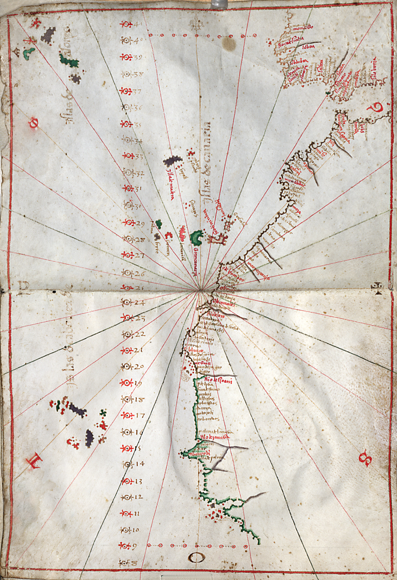
Portolan charts (or portolanos, from the Italian adjective portolano, “related to ports/harbors”) were early navigational aids for merchants and explorers, particularly in the Mediterranean region. They indicated the sequence of places along the coasts and provided lines of compass bearings, called rhumb lines, for directional guidance, showing the thirty-two points of the mariner’s compass.
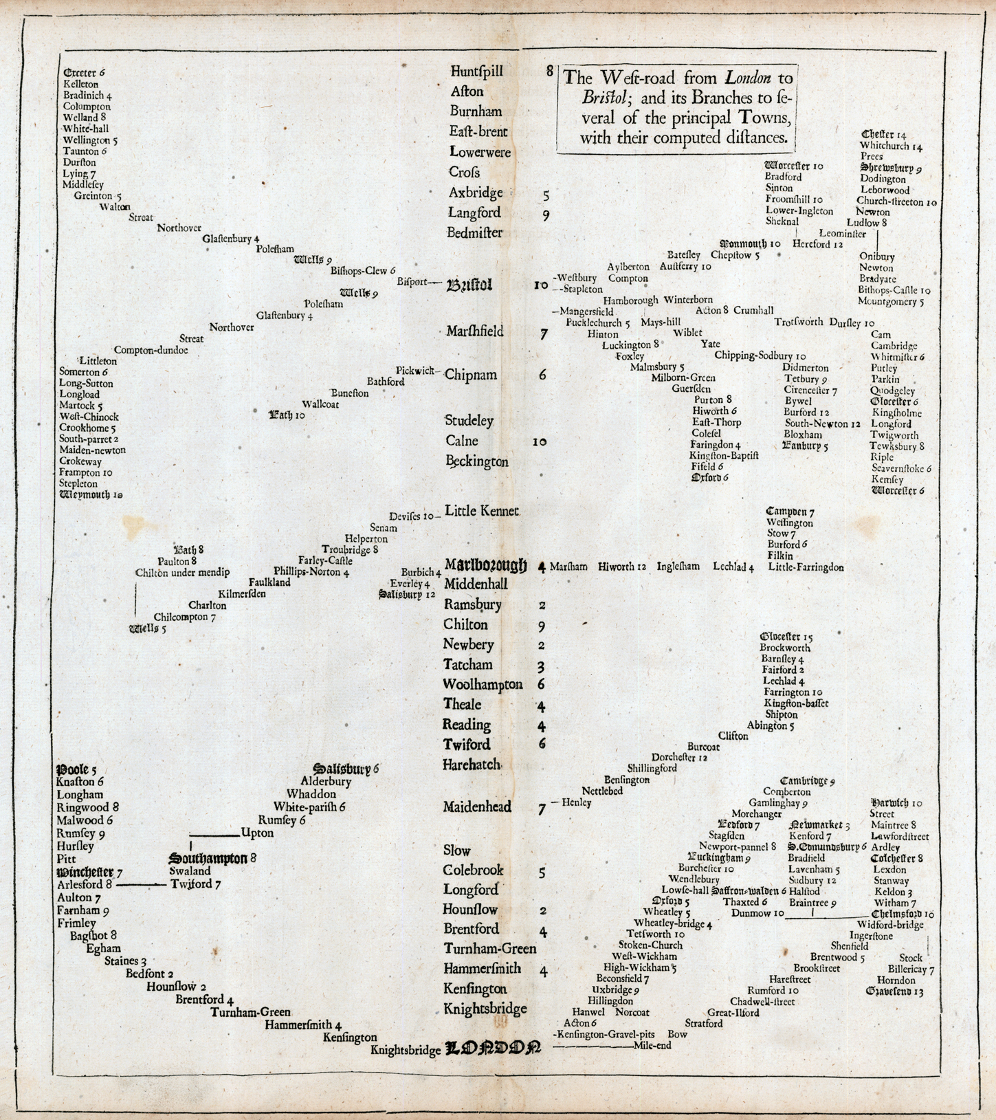
♦ “The West-Road from London to Bristol; and Its Branches to Several of the Principal Towns, with Their Computed Distances.” Letterpress table, 37.5 × 32.7 cm [Historic Maps Collection]. From John Speed’s The Theatre of the Empire of Great-Britain . . . (London: printed for Thomas Basset . . . and Richard Chiswel . . ., 1676). [For more on Speed, see the Military History part of the Qualitative Maps section.]
A stripped-down “map” that combines place names and relative distance with some sense of direction. Here, roads consist of stacks of place names; the title one (“West-Road”) runs up the spine of the page from London at the bottom. The names of larger towns are printed in bold, old English typeface letters. In the seventeenth century, one’s options for leaving London by foot or horse were few. Heading west on this road towards Bristol—which everyone would know (“you need to take the West Road . . .”)—one would expect to arrive in Hammersmith after four miles and reach Brentford via Turnham-Green after four more. (These localities are part of Greater London today.) From Maidenhead and Marlborough, other roads are shown going north. This hybrid approach, similar to a subway map today, has been an effective travel tool for over three hundred years.
- Distance scales distance × direction = itinerary)
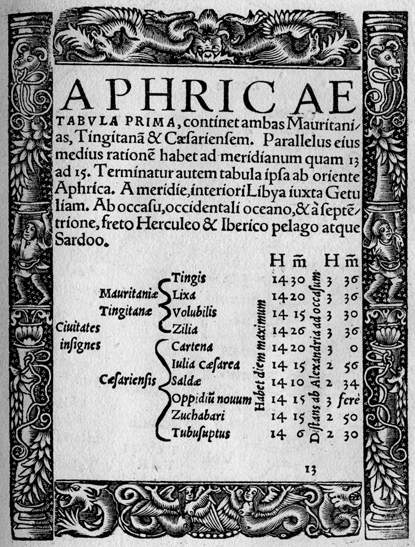
♦ ”Aphricae.” Woodcut-bordered table, 13.5 x 10.1 cm. Verso of “Aphricae Tabula I” map from Sebastian Münster’s edition of Ptolemy’s Geographia (Basel: apud Henricum Petrum, mense martio anno 1540) [Rare Books Division]. [For more on Ptolemy, see section 3 below.].
For each listed North African location, the data in the table show the length of its longest day (in hours and minutes) and its distance (in hours and minutes, hence time) west from Alexandria, Egypt.
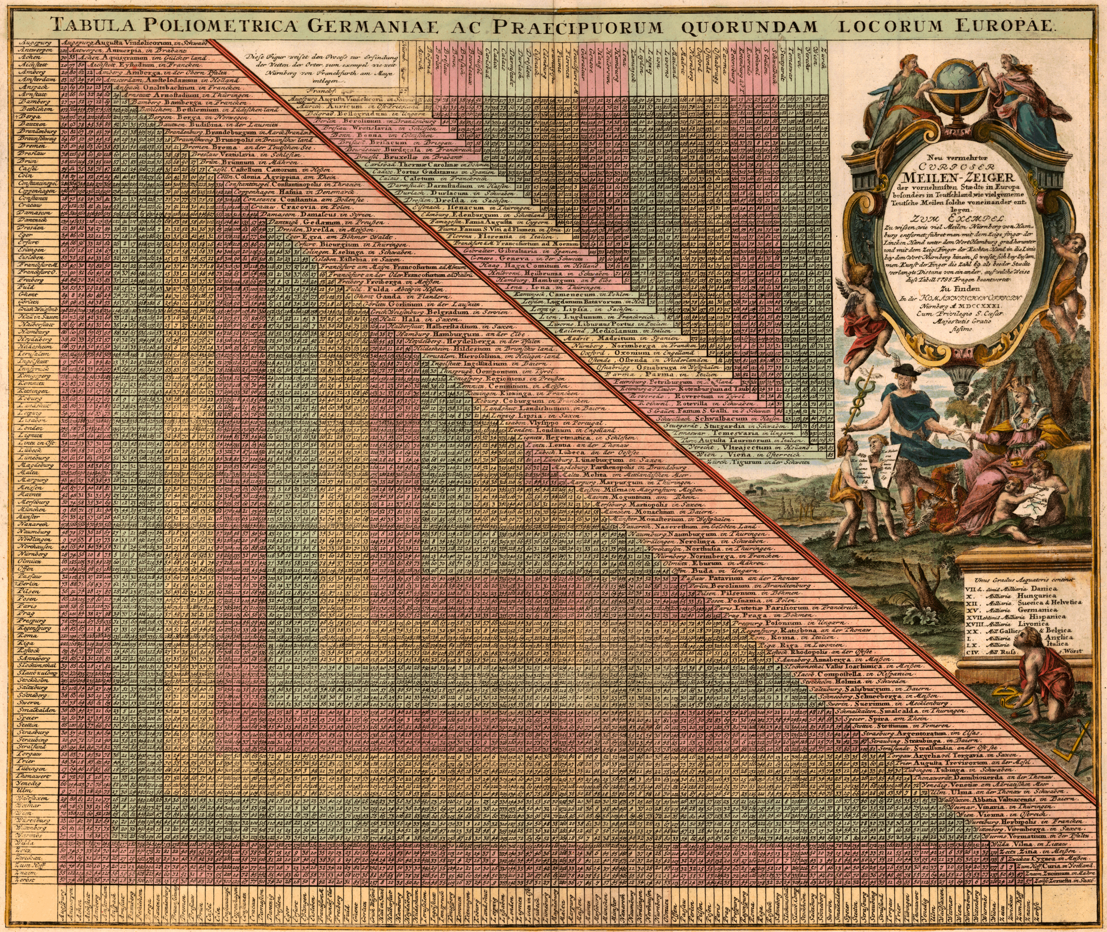
♦ “Neu vermehrter curioser Meilen-Zeiger der vornehmsten Staedte in Europa besonders in Teutschland wie-viel gemeine Teutsche Meilen solche voneinander entlegen . . . = Tabula poliometrica ac praecipuorum quorundam locorum Europae” (Nuremberg: Homannische Officin, 1731). Copperplate table, with added color, 45.8 × 54 cm [courtesy of John Delaney].
One of the most decorative tables of distances (in Roman miles) between major European cities printed in the eighteenth century. Not only were the data extremely useful for traveling but also for sending a letter, because distance, not weight, determined the price. (Notice the letter being exchanged in the cartouche.) Provided in the box at the lower right are distance equivalents of an equatorial compass degree (Unus gradus Aequatoris continet = One degree at the equator contains . . .), given in millaria (miles), for different countries; each used a different scale.
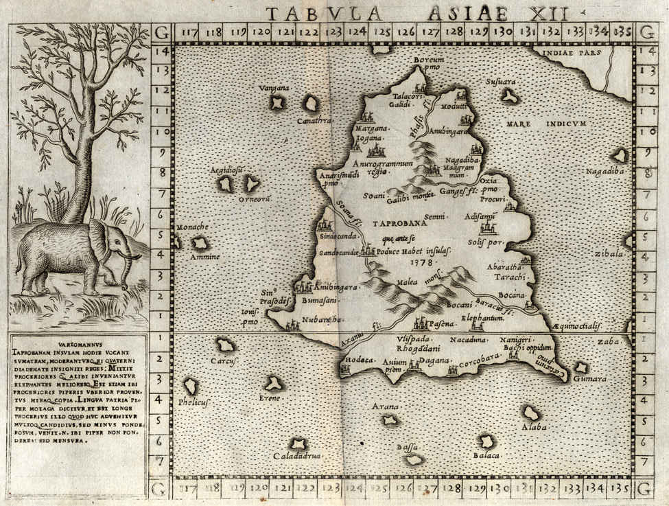
♦ “Tabula Asiae XII.” Copperplate map, 16 × 17 cm, on sheet 19 × 26 cm [Historic Maps Collection]. From Girolamo Ruscelli’s Geographia Cl. Ptolemaei Alexandrini (Venice: apud Vincentium Valgrisium, 1562).
Latitude and longitude lines began with the Geographia, a manual on the construction and drawing of maps, written in Alexandria, Egypt, about AD 160 by the mathematician, astronomer, and geographer Claudius Ptolemy (ca. AD 90–168). The European rediscovery of this work during the Renaissance, along with its numerous subsequent editions with maps created from its instructions, was a major milestone in cartographic history—the rest, as they say, is geography. On maps, the round earth soon acquired a girdle of 360º longitude (180º east and 180º west of a starting point, called the meridian) and a cap and bowl of 180º of latitude (90º north and 90º south of the equator).
This map of Sri Lanka (here called Taprobana, later, Ceylon), taken from Ruscelli’s edition of Ptolemy’s Geographia, places it roughly on the equator and near India, between 120 and 132 degrees east of the edge of Ptolemy’s known world (Canary Islands). The cartographer has added some interior place names and the most rudimentary topographic features of generalized mountains and rivers. Descriptive text and the decorative charm of an elephant shown in its natural environment, and presumably native to this island country, enrich the cartographic experience.
- Topographic Features ("dressing space")
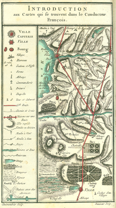
♦ “Introduction aux Cartes qui se trouvent dans le Conducteur François [sic].” Key to Louis Denis’s Le conducteur français: Contenant les routes desservies par les nouvelles messageries, diligences & autres voitures publiques avec un détail historique & topographique des endroits par où elles passent & de ceux qu’on peut appercevoir, des notes curieuses sur les Chaînes de Montagnes que l’on traverse, relativement au système physique de Philippe Buache, premier Géographe du Roi: Enrichi de cartes topographiques, dont les routes seront distinguées par une coleur: Dressées & dessinées sur les lieux (Paris: Chez Ribou, 1776–1780) [Rare Books Division].
Road maps might constitute another set of thematic maps in the widest sense, but this work has been chosen for its rich, and early, topographic treatment. Here in the general map key, a combination of color, shading, and symbols provides guidance to the usefulness of Denis’s route maps. These are early precursors of today’s familiar AAA TripTik maps, where striplike itineraries are annotated with descriptions of the interesting places encountered along the way. In 1675, British cartographer John Ogilby pioneered strip maps of English roads in his atlas Britannia, but his simple maps bore only rudimentary symbols. And Ogilby’s work followed a long tradition of printed itineraries, dating back to Flemish cartographer Abraham Ortelius’s version (1598) of the Tabula Peutingeriana (Peutinger Table), a thirteenth-century manuscript of the cursus publicus of the Roman emperors. [For more on this map, see the Ortelius entry in the Communication and Transportation section.]
- Coloring / Shading / Symbols (adding a thematic Z layer)
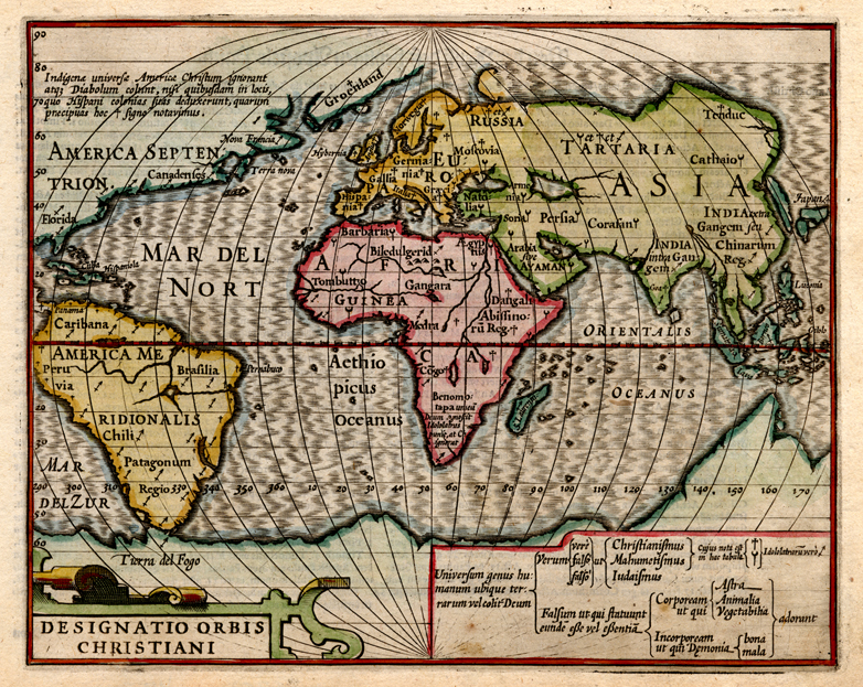
♦ “Designatio orbis Christiani.” Copperplate map, with added color, 15 × 19 cm [Historic Maps Collection]. From Jodocus Hondius’s Atlas Minor . . . (Amsterdam: excusum in aedibus Iodoci Hondii, veneunt etiam apud Corneliu[m] Nicolai, item apud Ioannem Ianssonium Arnhemi, [1609]). Reference: Shirley, Mapping of the World, 260.
Devoted to religion, this is one of the very earliest thematic maps. Three symbols (cross, crescent, arrow/spear) are used to designate Christian, Muslim, and idolatrous regions of the world. The map key, similar to a decision table, begins with the premise that everyone everywhere believes in a god, then breaks such spiritual faith into its various true/false permutations: true faith seems to be associated with organized religions—Christianity, Islam, Judaism (Christianity, of course, is the really true faith)—false with the worship of material bodies (stars/animals/vegetation) or good/bad spirits. Clearly, Christianity is in the minority. The moral of the map, addressed to its European audience, is that much proselytizing work needs to be done.
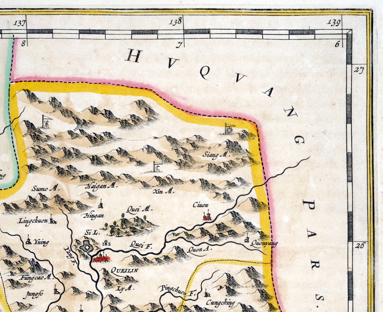
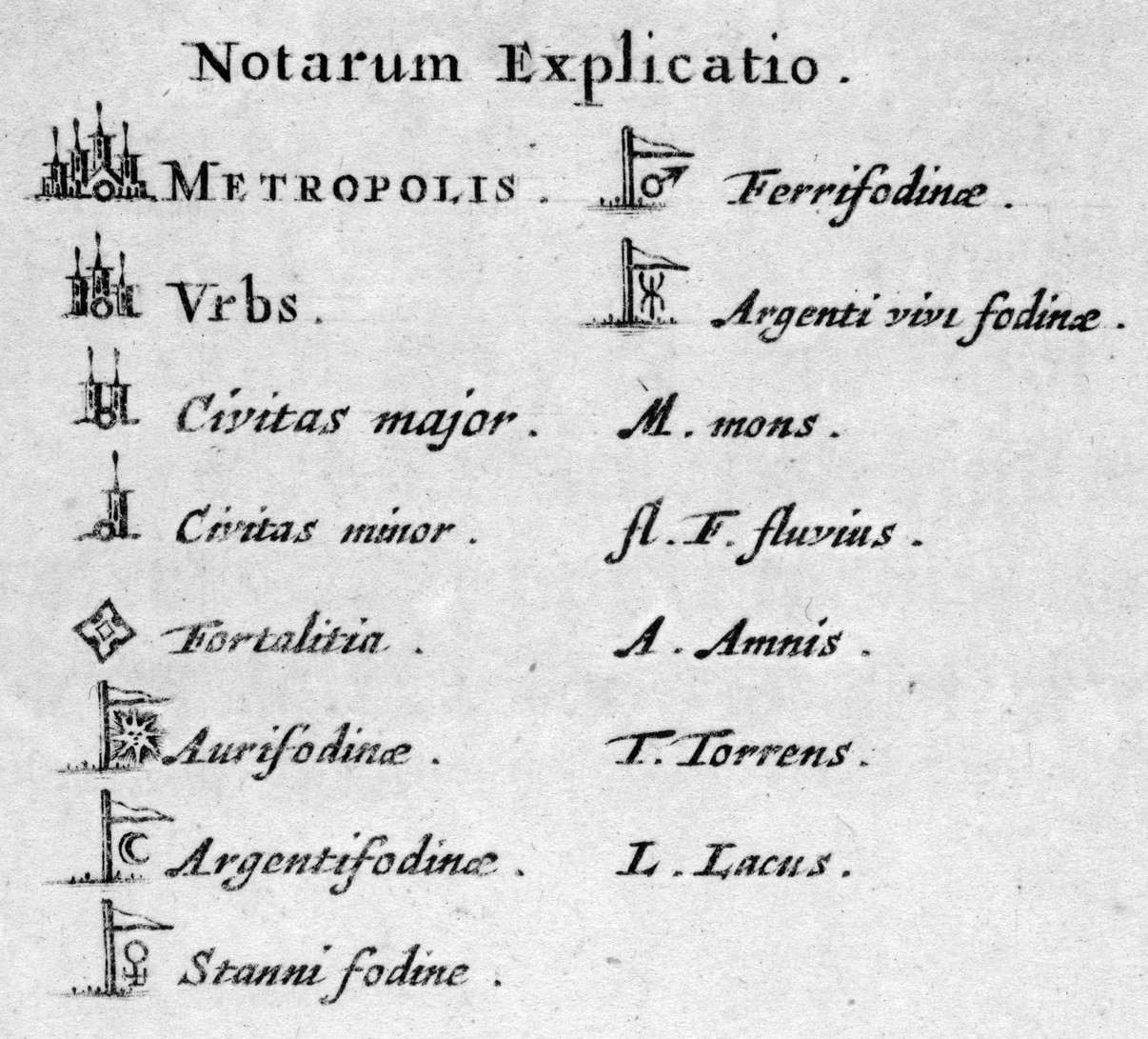
♦ Section of, and key to, “Quangsi, Sinarum Imperii Provincia Decimatertia.” Copperplate map, with added color, 37.7 × 40 cm. From Martino Martini’s Novus atlas Sinensis (Amsterdam: Blaeu, 1655) [Historic Maps Collection].
This map is from the first Western atlas of China. The keys to the province maps may be the earliest to contain symbols for geological purposes—here, for example, locating silver and iron mines.
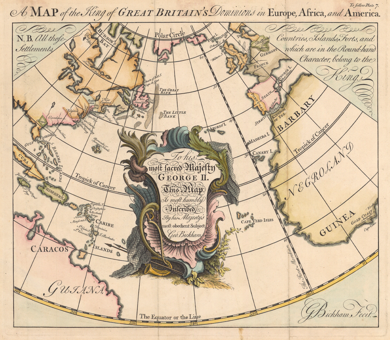
♦ “A Map of the King of Great Britain’s Dominions in Europe, Africa, and America.” Copperplate map, with added color, 26 × 31 cm [Historic Maps Collection]. From George Bickham’s A Short Description of the American Colonies Belonging to the Crown of Great Britain, in the British Monarchy . . . (London: G. Bickham, [1743–1749]).
In this early thematic map, Bickham cleverly uses a different font (script) to identify British possessions, which he explains in a note on the sides at the top of the map: “All those Countries, Islands, Forts, and Settlements, which are in the Round-hand Character, belong to the King.”
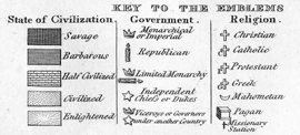
♦ “Key to the Emblems,” in William C. Woodbridge’s “Moral and Political Chart of the Inhabited World Exhibiting the Prevailing Religion, Form of Government, Degree of Civilization and Population of Each Country,” dated 1821. From his Woodbridge’s School Atlas, an Improved Edition . . . (Hartford [Conn.]: Oliver D. Cooke and Co., 1831) [Historic Maps Collection].
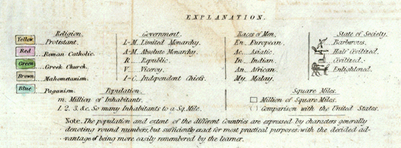
♦ “Explanation” key to Roswell Chamberlain Smith’s “A Chart Exhibiting the Actual and Comparative Size of Each Country, Nation, and Kingdom . . .” ([Philadelphia: W. Marshall, 1837, c1835]) [Historic Maps Collection].
Subjective data. Woodbridge used shading to characterize countries as either savage, barbarous, half-civilized, civilized, or enlightened—the lighter the shade, the more enlightened the country. Smith’s world map rates the “State of Society” of each country, reducing the categories to four and substituting symbols—bow and arrow, plough, church, and printing press—for each state. Neither map, nor Woodbridge’s text, defines its terms. Intuitively, the reader must know what constitutes a savage or barbarous state and what separates a civilized country from an enlightened one. Curiously, Woodbridge used what appears to be a crate or box to indicate pagan religions, as if he were anticipating by half a century the idea of “cargo cults.”
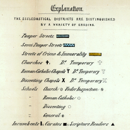
♦ “Explanation” to the frontispiece map “Liverpool, Ecclesiastical and Social.” From Abraham Hume’s Condition of Liverpool, Religious and Social, Including Notices of the State of Education, Morals, Pauperism, and Crime (Liverpool: T. Brakell, 1858) [Historic Maps Collection].
As seen from its key, this map from the “golden age” of thematic mapping, the mid-nineteenth century, offers a combination of coloring, shading, and symbols to convey its thematic purposes. Of course, the data behind Hume’s decisions are invisible.
This brief summary of cartographic evolution suggests how maps and charts developed, first to help us navigate our way around the geographical world by (1) naming places, (2) plotting their relative order and distance from each other, (3) locking their locations on a universal, scientific grid, and (4) describing their natural (and some man-made) features—and then took another step by (5) adding interpretative layers of information about them, which usually required map keys. Voilà: thematic maps.
On this website, you will find early, if not the earliest, thematic maps in various disciplines; in some cases the maps literally changed the world in the sense that new scientific avenues of investigation resulted. An obvious example of this would be German naturalist Alexander von Humboldt’s isotherms map (1817), which showed contour lines of equal temperature—seemingly innocuous when it first appeared in a small journal but revolutionary in nature and infinitely useful since. Think of its application to the current global warming debate, almost two hundred years later.
My thinking in organizing the sections of this site is that English philosopher and scientist Francis Bacon provided the theory, Alexander von Humboldt the interdisciplinary methodology and vision. Brief biographical sketches of these two luminaries immediately follow this introduction. The rest of the men (and one woman) featured are their intellectual disciples and descendants, reaping the initial “crops” of their respective fields.
There are two basic classes of thematic maps: quantitative, those that rely on numerical data (for example, population density), and qualitative, those that emphasize non-numeric features of a geographic area (locations of hospitals, for instance). In the site's main section, fundamental areas of quantitative maps—meteorology, geology, hydrography, natural history, medicine, and sociology and economics—are treated first, followed by a selective number of categories of qualitative maps. There are almost unlimited sources for the latter; the topics I have chosen—communication and transportation, ethnography, linguistics, military history, and urban planning—offer interesting opportunities for the use of thematic maps, suggesting the tremendous possibilities of the genre.
Preceding these two classes of thematic maps is a section devoted to landmark nineteenth-century atlases that revolutionized cartography. The emphasis is not only on the unique sorts of maps that these collections showcased, but also on the men who saw the need for them.
Wait. There’s more. The last section, Theme Maps (Fanta “Z”), suggests that when imagination meets geography, the need for data disappears, and the result is symbolic cartography, where places are named and shaped according to a subjective theme. Literature, love and marriage, utopia—these have been historically rich fields for this kind of Ur-thematic map, often referred to as a cartographic curiosity.
[The historical development of GIS (Geographic Information System) technology and its dramatic effects on geography/cartography is treated in a "perspective" essay by Tsering Wangyal Shawa, Princeton's GIS librarian, in the volume published to accompany this exhibtion. See more about the book here.]
